

Print lingo doesn’t have to be intimidating — here’s your go-to guide for understanding key print terms.
In the world of print, there’s a certain jargon that can be overwhelming. Terms like CMYK, bleed, and DPI may sound like they belong in a tech lab rather than the design studio, but understanding them is crucial if you want your print materials to look their best.
Here’s a straightforward guide to demystifying the most common print terms, so you can avoid costly mistakes and impress your clients with your newfound knowledge.
CMYK: The Colour Code of Print
Let’s start with CMYK — the colour model used in the majority of printed materials. If you've ever worked with a printer, you’ve probably come across this term.
What is CMYK?
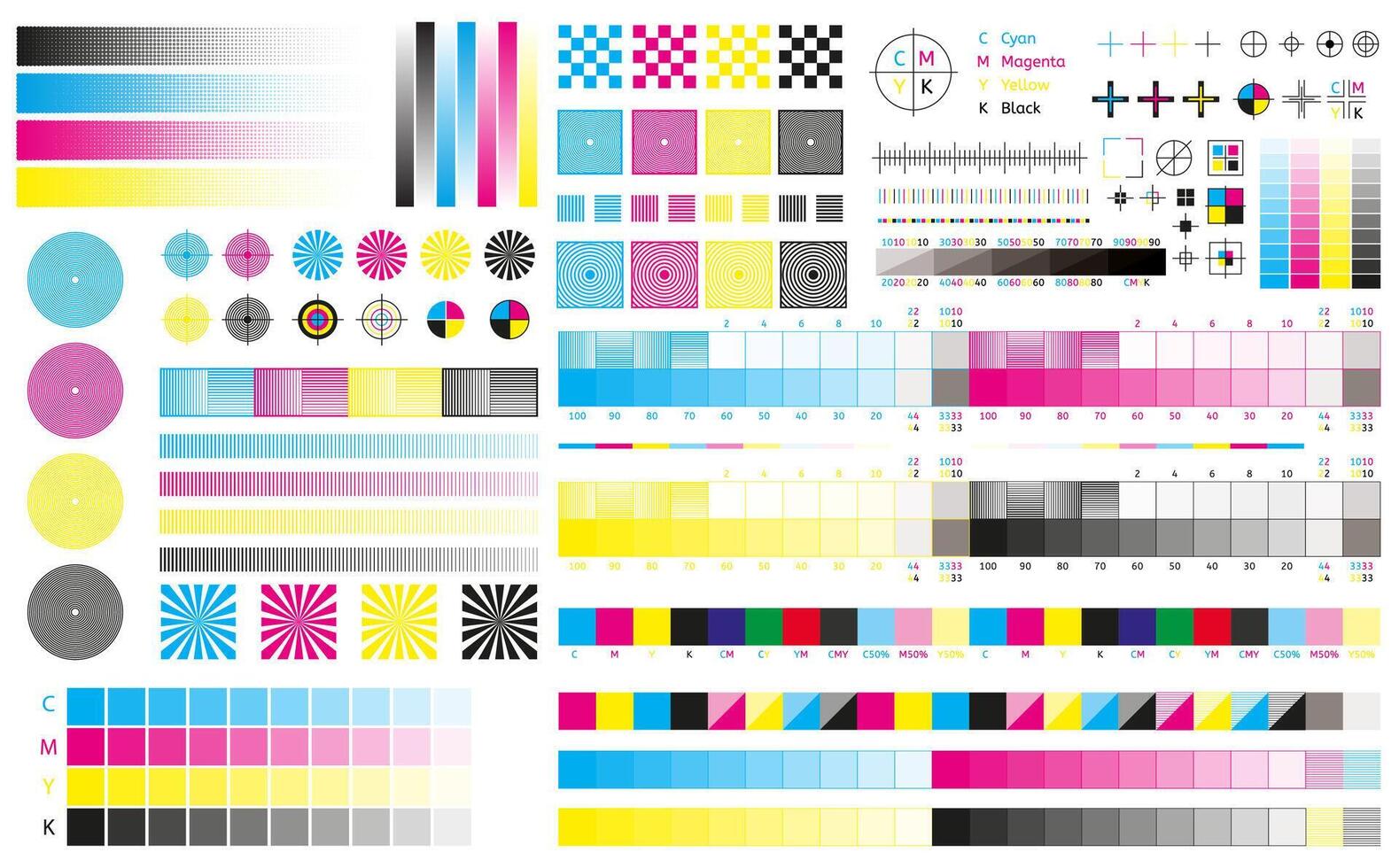
CMYK stands for Cyan, Magenta, Yellow, and Key (Black). These four colours are used in combination to create almost every colour you see in printed materials. Unlike RGB (which is used for screens and is made up of Red, Green, and Blue), CMYK uses subtractive colour mixing — meaning the more ink you add, the darker the result.
Why It Matters
When preparing your files for print, it’s essential to work in CMYK. RGB colours won’t always translate properly in print, often leading to colour shifts or dull, inaccurate results. Always make sure your design files are in the CMYK colour space before sending them to print.
Tip: If you’re using design software like Adobe Illustrator or Photoshop, make sure your document is set to CMYK mode from the beginning. This way, your colours will stay consistent from screen to print.
Bleed: Extending Beyond the Edge
Next up is bleed — one of the most crucial yet often misunderstood print terms.
What is Bleed?
Bleed refers to the extra area added to the edges of your design that will be trimmed off during printing. This ensures that there’s no white border left around your printed materials, even if there are slight shifts during the trimming process.
Why It Matters
Without bleed, you risk having unsightly white lines at the edges of your design, especially if the printing or trimming isn’t 100% accurate. A bleed typically extends about 3mm beyond the edge of your design.
Tip: Always make sure your design extends to the bleed area and that no important text or logos are placed in this space. If you’re not sure how much bleed to include, check with your printer or design software, as different printers may have slightly different requirements.
DPI: Precision in Print
Last but not least is DPI, or Dots Per Inch. DPI measures the resolution of your printed image — essentially, how many tiny dots of ink the printer uses to create the image.
What is DPI?
DPI refers to the number of individual dots a printer can place per inch of paper. The higher the DPI, the sharper and more detailed your image will be. For most print materials, you’ll want your images to be at 300 DPI for optimal quality.
Why It Matters
If your image resolution is too low (say, 72 DPI), your printed materials may appear pixelated or blurry. For clear, professional prints, always ensure your image resolution is at least 300 DPI at the size it will appear on the final print.
Tip: When you’re setting up files for print, always check the image resolution. Low-quality images or stretched graphics won’t hold up in print and will affect the overall look of your materials.
What Are Vector Graphics?
What are Vector Graphics?
Vector graphics are images created using mathematical equations and geometric shapes, such as lines, circles, and polygons. Unlike raster (bitmap) images, which are made up of pixels, vector graphics are scalable without losing quality.
Why They Matter
The beauty of vector graphics lies in their scalability. Whether you need a small logo or a large billboard, a vector file will look sharp and crisp at any size. This is especially important in print, where large formats are common.
Common file types for vector graphics include AI (Adobe Illustrator), SVG (Scalable Vector Graphics), and EPS (Encapsulated PostScript). These files are ideal for logos, illustrations, and any design that needs to be resized without losing resolution.
Tip: When preparing a logo or illustration for print, always send the vector file. This ensures that it will be printed with the highest quality possible, regardless of size.
Common Print File Mistakes to Avoid
Now that you know what these terms mean, let’s go over a few mistakes to avoid when preparing your files:
-
Not embedding fonts: If you send a file with missing fonts, the printer might substitute fonts, resulting in an inconsistent look. Always embed fonts in your files or convert text to outlines.
-
Ignoring colour settings: As mentioned earlier, sending an RGB file for print can lead to colour discrepancies. Always convert your images to CMYK before printing.
-
Using low-resolution images: A common mistake is using low-res images pulled from the web. Always use high-res images (300 DPI) that are suitable for print.
The Right Print Settings for Different Projects
Depending on the project, different settings might be required. Here's a quick reference:
| Project | Colour Mode | Bleed | DPI |
|---|---|---|---|
| Business cards | CMYK | Yes (3mm) | 300 DPI |
| Flyers | CMYK | Yes (3mm) | 300 DPI |
| Posters | CMYK | Yes (5mm) | 300 DPI |
| Large-format prints | CMYK | Yes (10mm) | 150-300 DPI (depends on viewing distance) |
Always check with your printer to ensure you’ve got the right specs for the project. Talk to Marina, Anna & Mike for all your print, promotional and signage requirements: design@officemaster.ie
Print lingo doesn’t have to be intimidating — here’s your go-to guide for understanding key print terms.
In the world of print, there’s a certain jargon that can be overwhelming. Terms like CMYK, bleed, and DPI may sound like they belong in a tech lab rather than the design studio, but understanding them is crucial if you want your print materials to look their best.
Here’s a straightforward guide to demystifying the most common print terms, so you can avoid costly mistakes and impress your clients with your newfound knowledge.
CMYK: The Colour Code of Print
Let’s start with CMYK — the colour model used in the majority of printed materials. If you've ever worked with a printer, you’ve probably come across this term.
What is CMYK?
CMYK stands for Cyan, Magenta, Yellow, and Key (Black). These four colours are used in combination to create almost every colour you see in printed materials. Unlike RGB (which is used for screens and is made up of Red, Green, and Blue), CMYK uses subtractive colour mixing — meaning the more ink you add, the darker the result.
Why It Matters
When preparing your files for print, it’s essential to work in CMYK. RGB colours won’t always translate properly in print, often leading to colour shifts or dull, inaccurate results. Always make sure your design files are in the CMYK colour space before sending them to print.
Tip: If you’re using design software like Adobe Illustrator or Photoshop, make sure your document is set to CMYK mode from the beginning. This way, your colours will stay consistent from screen to print.
Bleed: Extending Beyond the Edge
Next up is bleed — one of the most crucial yet often misunderstood print terms.
What is Bleed?
Bleed refers to the extra area added to the edges of your design that will be trimmed off during printing. This ensures that there’s no white border left around your printed materials, even if there are slight shifts during the trimming process.
Why It Matters
Without bleed, you risk having unsightly white lines at the edges of your design, especially if the printing or trimming isn’t 100% accurate. A bleed typically extends about 3mm beyond the edge of your design.
Tip: Always make sure your design extends to the bleed area and that no important text or logos are placed in this space. If you’re not sure how much bleed to include, check with your printer or design software, as different printers may have slightly different requirements.
DPI: Precision in Print
Last but not least is DPI, or Dots Per Inch. DPI measures the resolution of your printed image — essentially, how many tiny dots of ink the printer uses to create the image.
What is DPI?
DPI refers to the number of individual dots a printer can place per inch of paper. The higher the DPI, the sharper and more detailed your image will be. For most print materials, you’ll want your images to be at 300 DPI for optimal quality.
Why It Matters
If your image resolution is too low (say, 72 DPI), your printed materials may appear pixelated or blurry. For clear, professional prints, always ensure your image resolution is at least 300 DPI at the size it will appear on the final print.
Tip: When you’re setting up files for print, always check the image resolution. Low-quality images or stretched graphics won’t hold up in print and will affect the overall look of your materials.
What Are Vector Graphics?
What are Vector Graphics?
Vector graphics are images created using mathematical equations and geometric shapes, such as lines, circles, and polygons. Unlike raster (bitmap) images, which are made up of pixels, vector graphics are scalable without losing quality.
Why They Matter
The beauty of vector graphics lies in their scalability. Whether you need a small logo or a large billboard, a vector file will look sharp and crisp at any size. This is especially important in print, where large formats are common.
Common file types for vector graphics include AI (Adobe Illustrator), SVG (Scalable Vector Graphics), and EPS (Encapsulated PostScript). These files are ideal for logos, illustrations, and any design that needs to be resized without losing resolution.
Tip: When preparing a logo or illustration for print, always send the vector file. This ensures that it will be printed with the highest quality possible, regardless of size.
Common Print File Mistakes to Avoid
Now that you know what these terms mean, let’s go over a few mistakes to avoid when preparing your files:
-
Not embedding fonts: If you send a file with missing fonts, the printer might substitute fonts, resulting in an inconsistent look. Always embed fonts in your files or convert text to outlines.
-
Ignoring colour settings: As mentioned earlier, sending an RGB file for print can lead to colour discrepancies. Always convert your images to CMYK before printing.
-
Using low-resolution images: A common mistake is using low-res images pulled from the web. Always use high-res images (300 DPI) that are suitable for print.
The Right Print Settings for Different Projects
Depending on the project, different settings might be required. Here's a quick reference:
| Project | Colour Mode | Bleed | DPI |
|---|---|---|---|
| Business cards | CMYK | Yes (3mm) | 300 DPI |
| Flyers | CMYK | Yes (3mm) | 300 DPI |
| Posters | CMYK | Yes (5mm) | 300 DPI |
| Large-format prints | CMYK | Yes (10mm) | 150-300 DPI (depends on viewing distance) |
Always check with your printer to ensure you’ve got the right specs for the project. Talk to Marina, Anna & Mike for all your print, promotional and signage requirements: design@officemaster.ie
